
Here's everything you need to know about this picture
Full disclosure: Okay, let's be real: I love the stuff I share, and sometimes I get a little kickback if you buy it. But don't worry, it won't cost you extra and it helps fund my coloring obsession! Win-win!

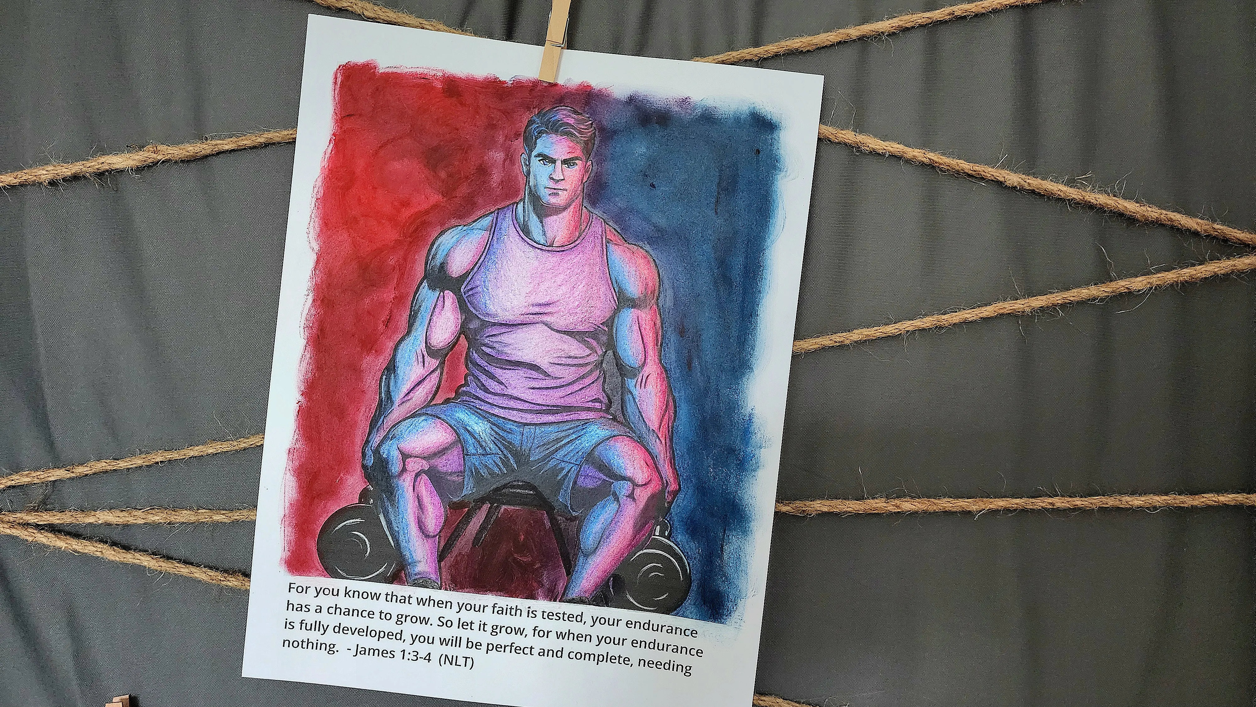
This coloring page is from the devotional
Regaining Hope
I made some mistakes...
If you watched the time-lapse video you'll notice that the face starts out much darker.
Here's what I learned!
You need a focal point for an image. Coloring the face to match the rest of the image left the image very dark. I ended up lightening the blue on the face. This gave the image a focal point which improved the overall image.
Also, I used my Arteza pencils for the entire body. Since the face requires more detail I should have use my SJ Star-Joy pencils to get a more refined image. The face would have had much more depth and character had I done that.
Lastly, I made a complete mess of the verse of the week. From here on out I will be taping the borders of my image so my coloring doesn't go crazy and obscure the verse.
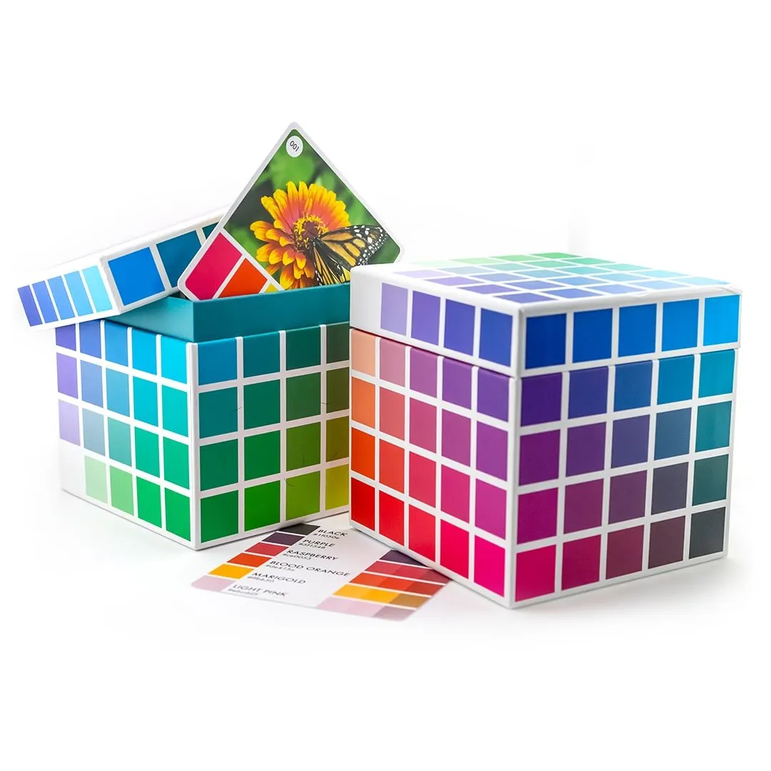
For color inspiration I used a
Color Palette
Sarah Renae Clark has hundreds of color palettes!
These help your images have a more cohesive look. For this image I used palette #209 from Color Cube 1. Find out more here.
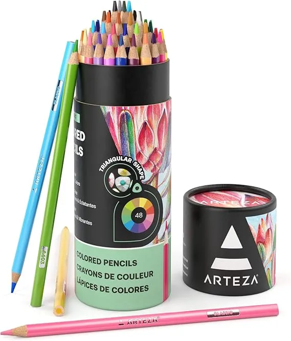
The majority of the page was colored with
Arteza Pencils
I used the set of 48 (as shown) but...
If I were to order this again I would order the set of 72 in order to have more skin tone colors. Check it out here.
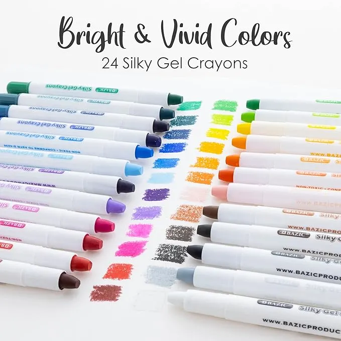
To save time and to create the stormy look I wanted for the background, I used
Gel Crayons
You can get great coverage, much faster with these.
This saves your hand from getting so tired, saves precious time, and they are much less expensive than quality pencils. Since you can color over them with colored pencils, they are great for laying a base layer for larger areas you have to color, saving you time and effort.
I use the rough side of the Caran D'ache Palette to lay and blend my colors. Then I use blending brushes to lay the color on the page.
These are a budget brand of Gel Crayons which can get a little clumpy. If you want the best, check out Faber Castell Gelato Paint Sticks.
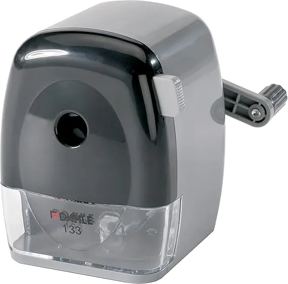
I get minimal breakage with this
Pencil Sharpener
My pencils would break in the sharpener all the time...
but this pencil sharpener grips the pencil to keep it aligned just right. You also can adjust the angle of the point so your pencils are sharpened just the way you want them.
This smaller sharpener is just as good.
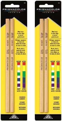
To brighten and smooth the pencils I used
Prismacolor Blender Pencils
This may not be necessary if you naturally color with a heavy hand.
Many artists just use the colored pencils themselves to blend. I tend to have a lighter hand, so blending tools are my preference.
Another great option are blending stumps.
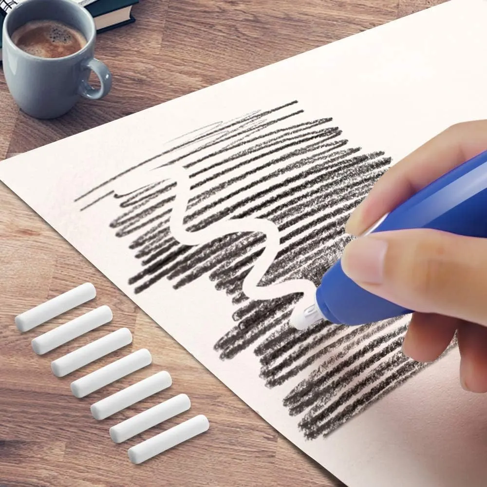
I had to fix a pretty big error in this image with an
Electric Eraser
I had already colored several layers on the face
and realized it was way too dark. I couldn't risk damaging the paper any more and needed more precision than my eraser pen allowed. My electric eraser did the job.
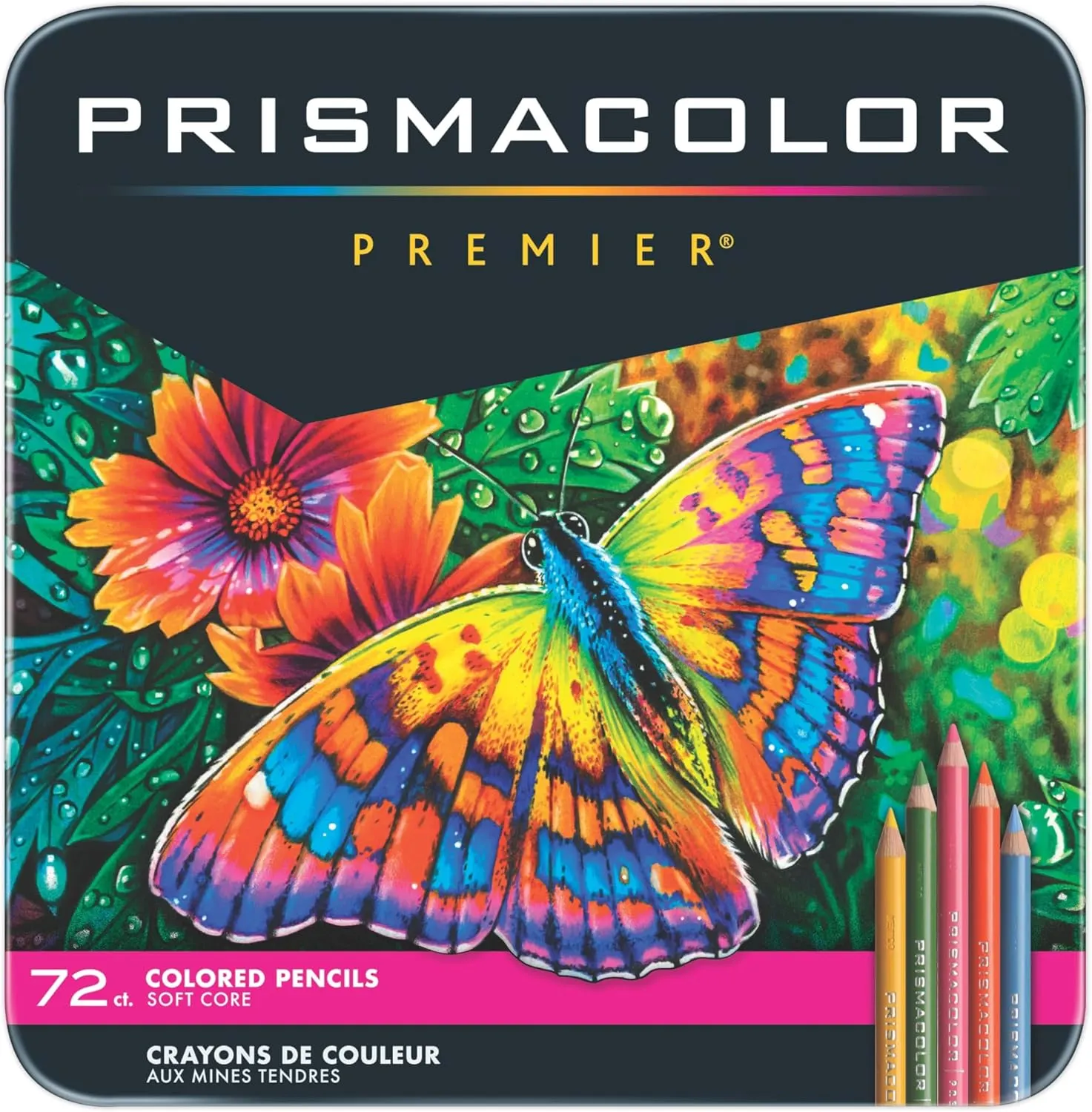
I needed a softer pencil to fix my mistake, so I grabbed my
Prismacolor Pencils
These are softer, and able to lay on the page with minimal damage to the tooth of the paper.
These pencils are a favorite among artists for their exceptional layering and blending capabilities. Their softness allows for effortless application, reducing hand fatigue compared to harder pencils.
© 2026 LisaThurston.com