
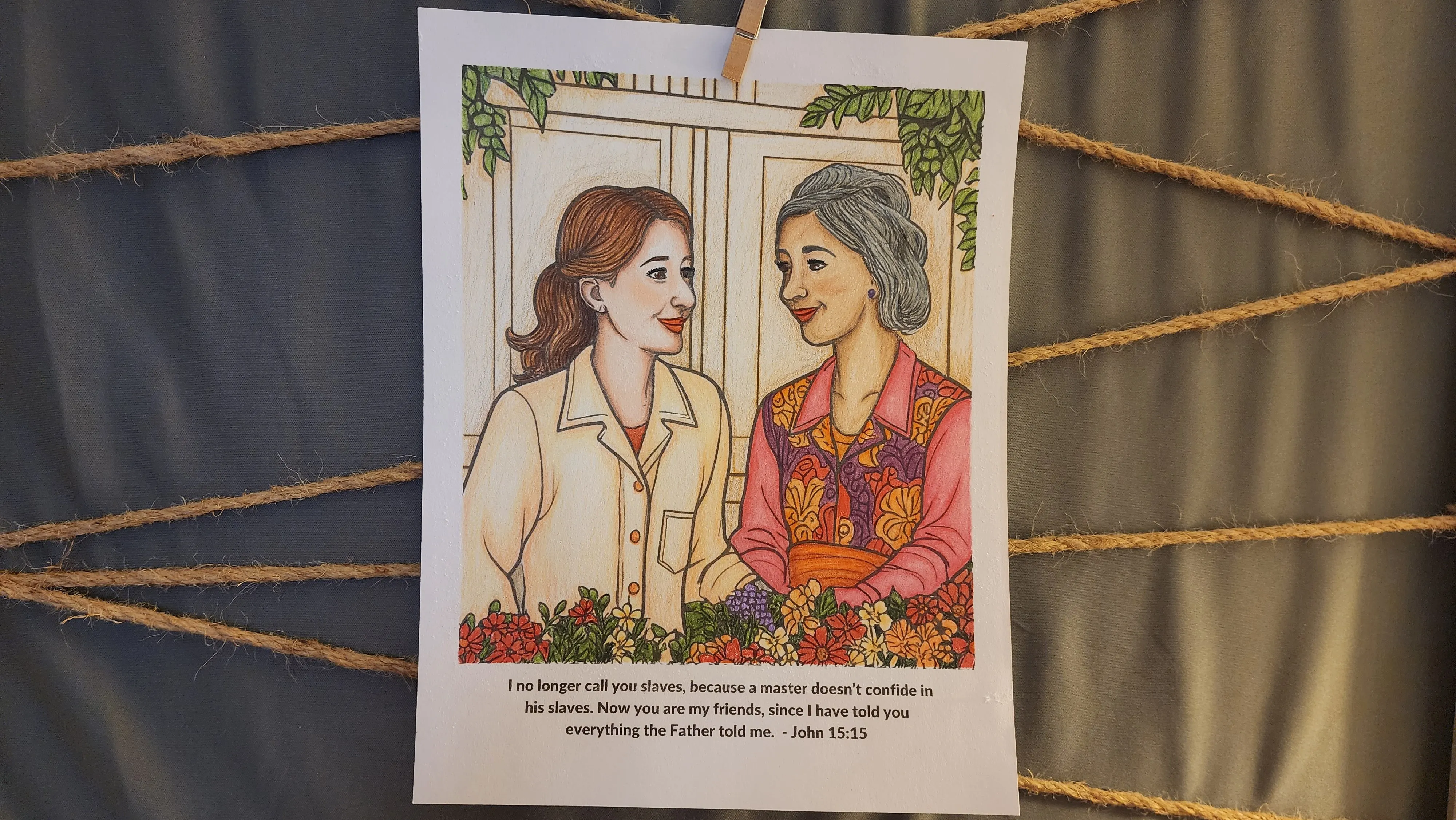
Here's everything you need to know about this picture
Full disclosure: Okay, let's be real: I love the stuff I share, and sometimes I get a little kickback if you buy it. But don't worry, it won't cost you extra and it helps fund my coloring obsession! Win-win!
I made a mistake...
I just didn't like how this turned out.
Here's what I learned!
I had a general idea in my head of what I wanted to do with the image, but I relied on my gut rather than finding reference images. It really is worth the time to find images, especially of people, to understand the coloring and shading that you need to apply to your image.
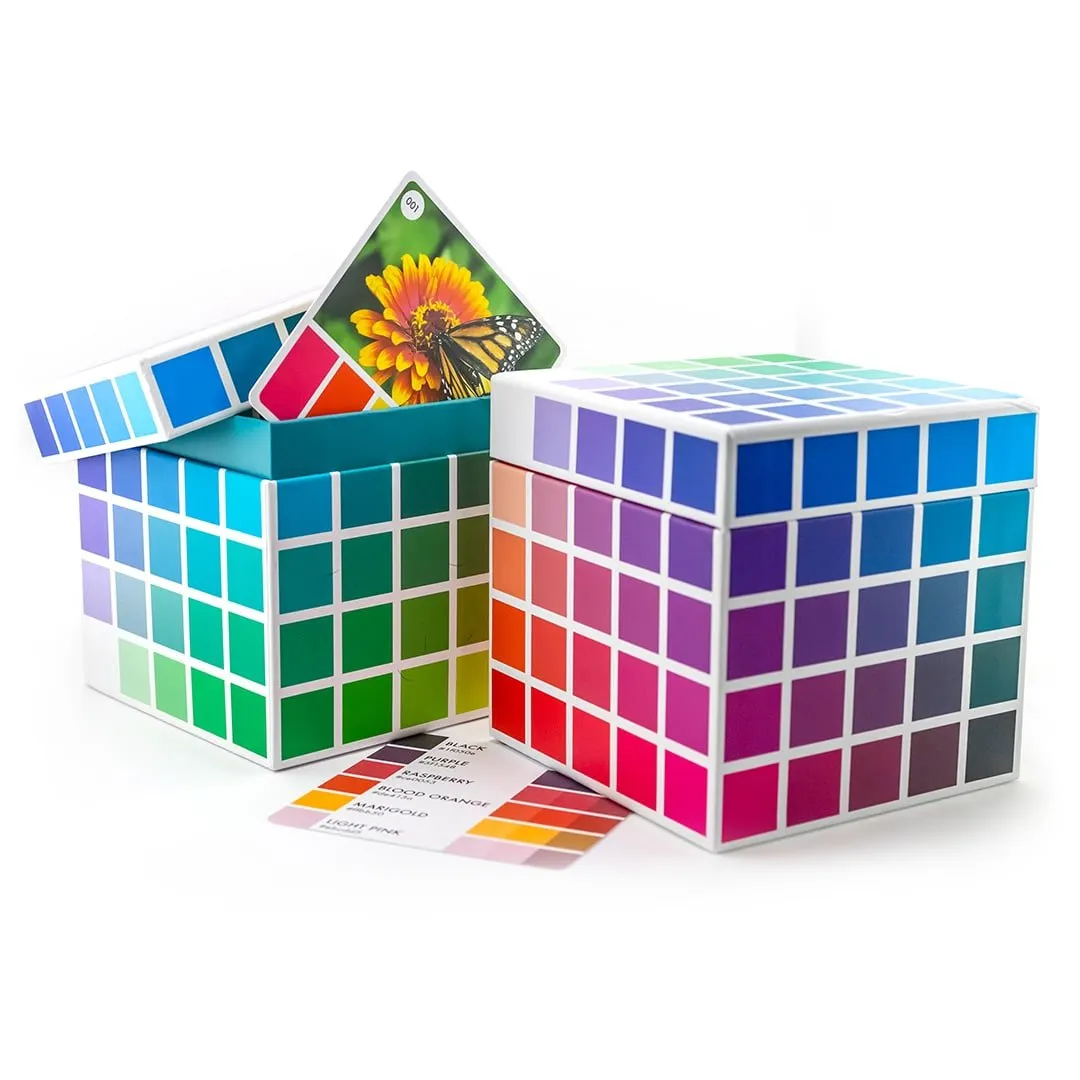
For color inspiration I used a
Color Palette
Sarah Renae Clark has hundreds of color palettes!
These help your images have a more cohesive look. For this image I used palette #415 from Color Cube 2.
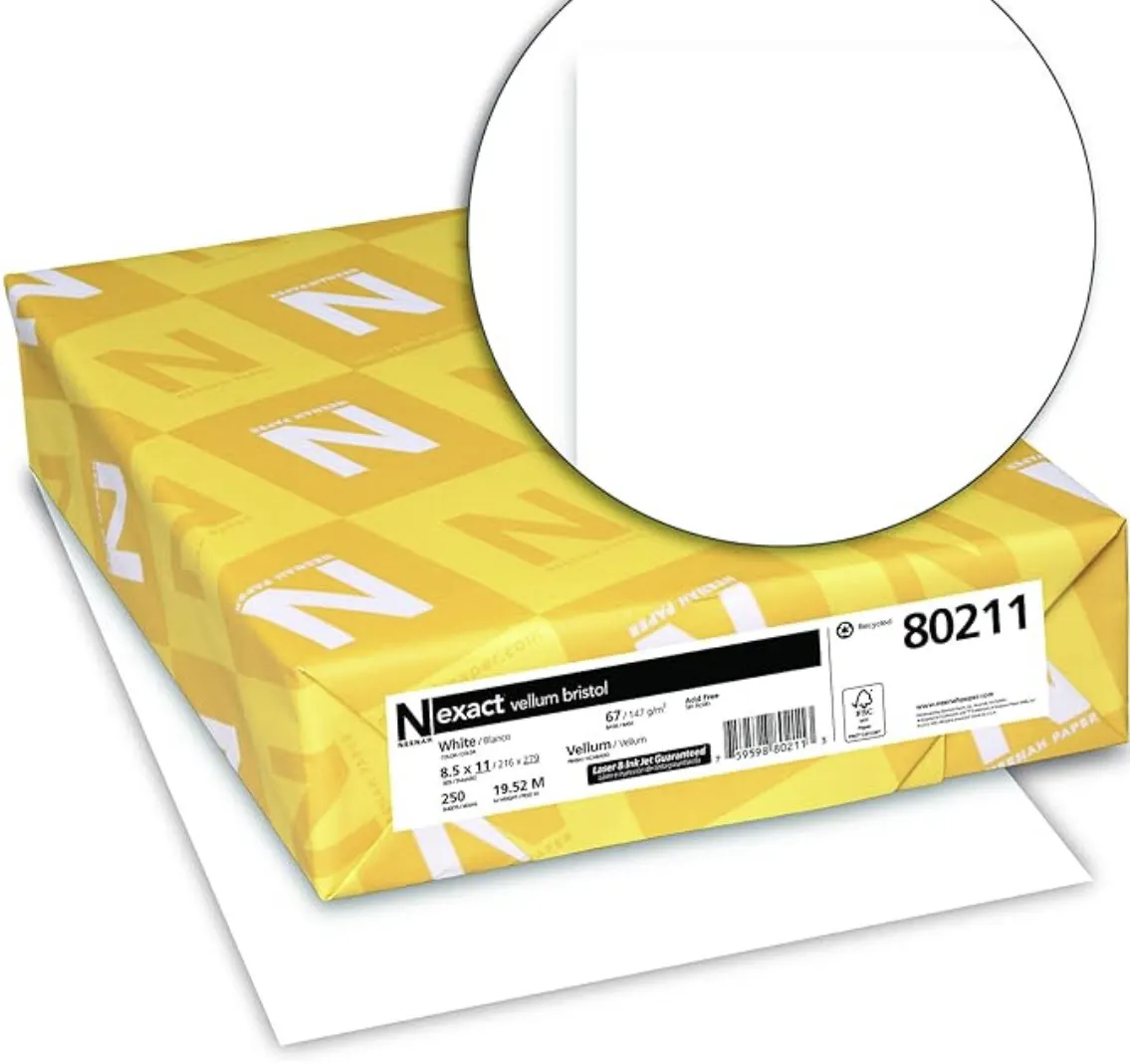
I printed my coloring page on
Vullum Bristol Paper
There are several benefits.
Printing your coloring pages on high-quality paper gives you a better coloring experience than coloring directly in a book. Thicker, textured paper can handle more layers, allowing for deeper color saturation, smoother blending, and cleaner details. It also holds up better to markers, pencils, and mixed media, resulting in a more polished and professional-looking finished piece.
You can get printable coloring pages here.
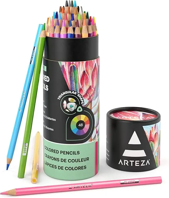
I did a little bit of shading with
Arteza Pencils
I used the set of 48 (as shown) but...
If I were to order this again I would order the set of 72 in order to have more skin tone colors. Check it out here.
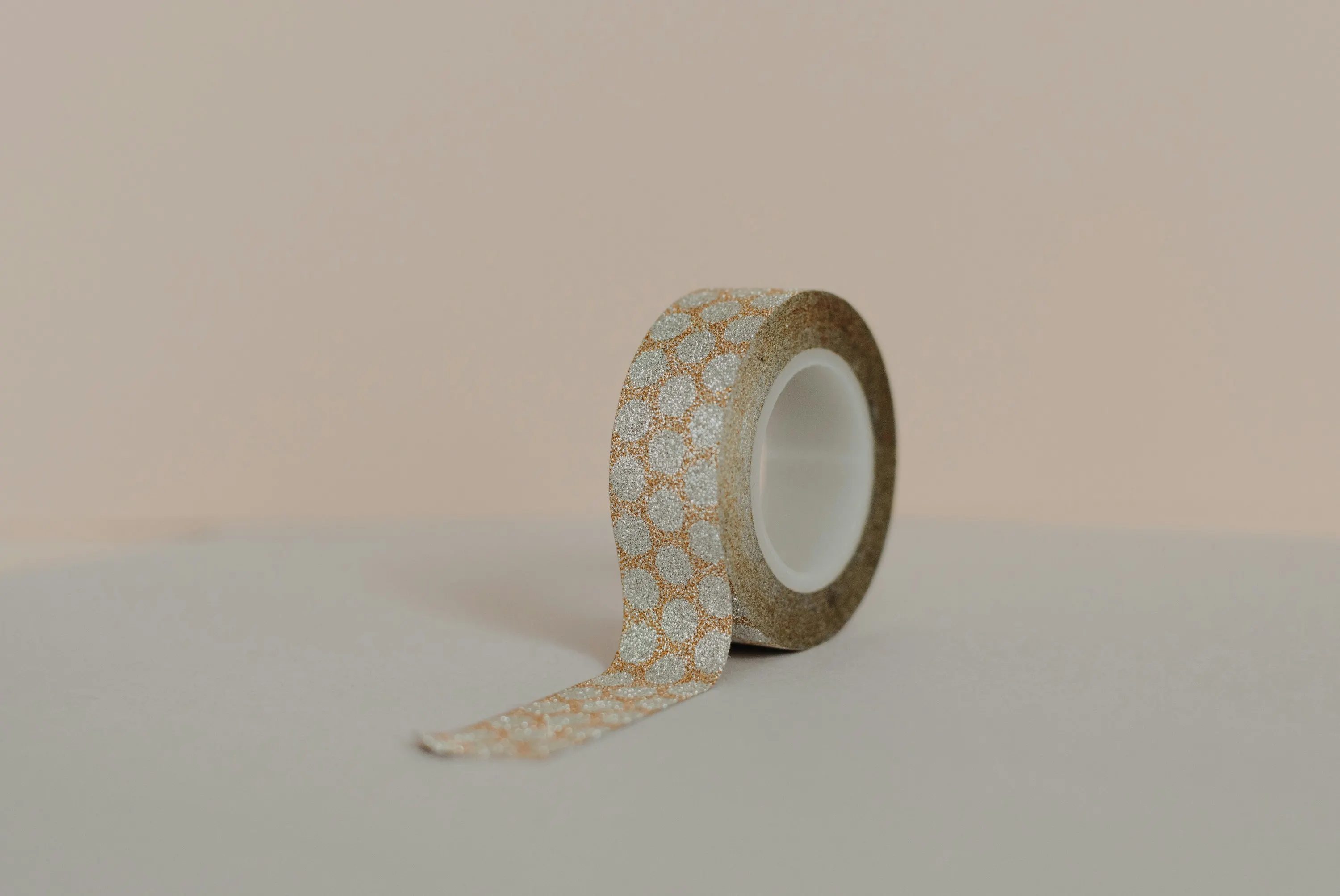
I taped the borders of my image with
Washi Tape
There are several benefits.
It will protect the borders of your image, giving you cleaner lines, and keeping you from coloring over the bible verse like I've done in the past. Also, it can protect your table. When color outside the lines your color on your tape instead of your table.
Painters tape is another good option.
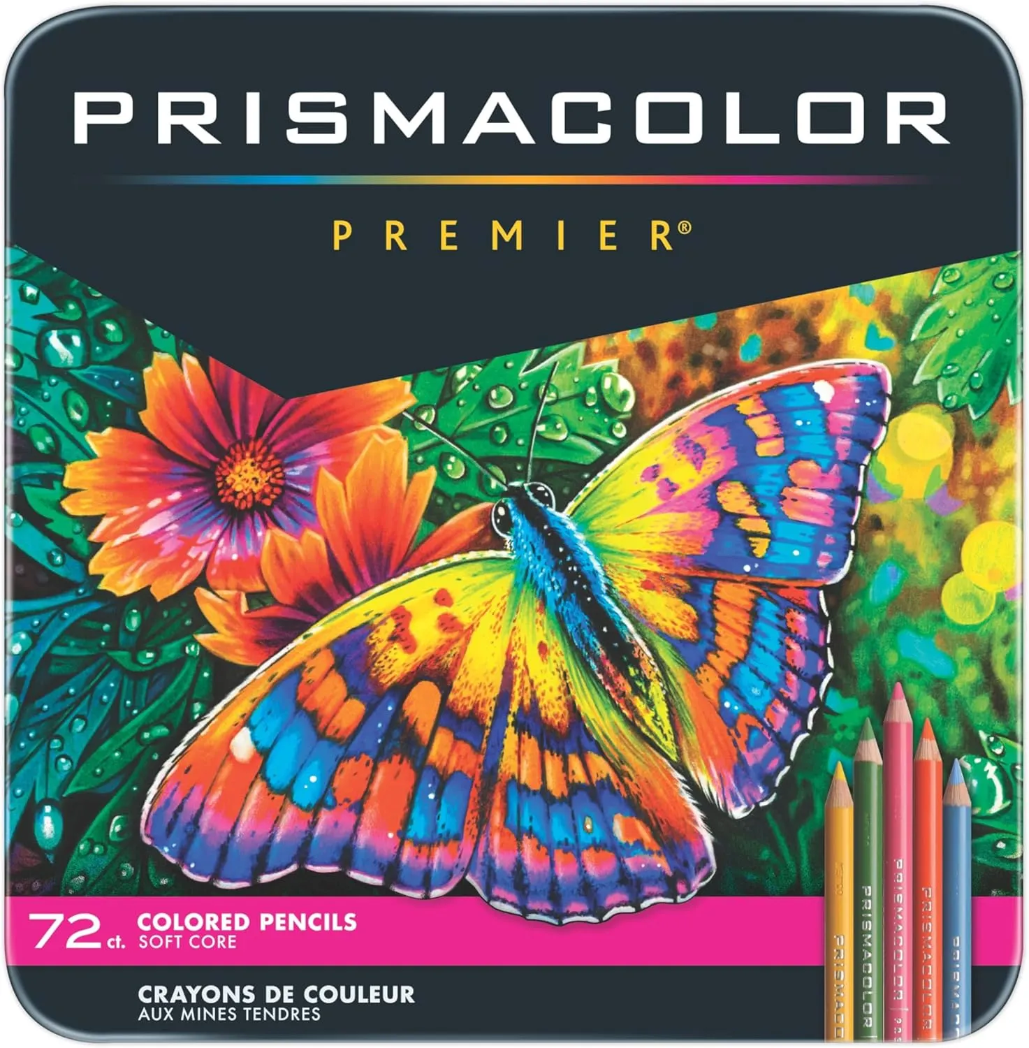
For the skin, I grabbed my
Prismacolor Pencils
These are softer, and able to lay on the page with minimal damage to the tooth of the paper.
These pencils are a favorite among artists for their exceptional layering and blending capabilities. Their softness allows for effortless application, reducing hand fatigue compared to harder pencils.
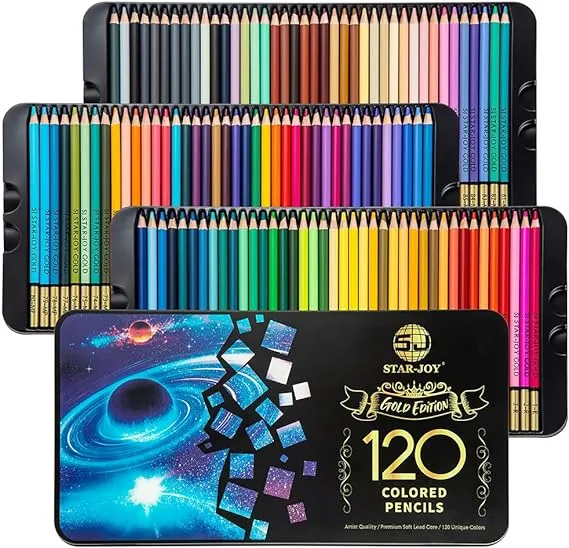
For the details, like the hair, I used
SJ Star-Joy
These are harder pencils.
This means they keep a sharper point and can handle details without constantly sharpening your pencils.
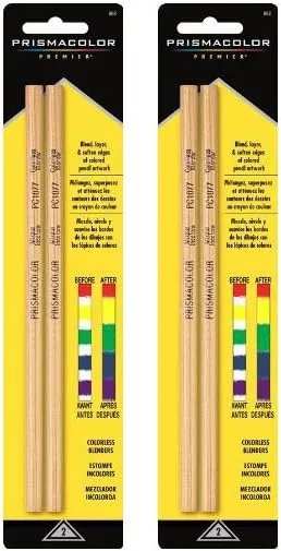
To brighten and smooth the pencils I used
Prismacolor Blender Pencils
This may not be necessary if you naturally color with a heavy hand.
Many artists just use the colored pencils themselves to blend. I tend to have a lighter hand, so blending tools are my preference.
Another great option are blending stumps.
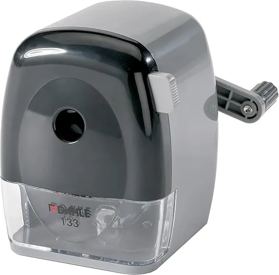
I get minimal breakage with this
Pencil Sharpener
My pencils would break in the sharpener all the time...
but this pencil sharpener grips the pencil to keep it aligned just right. You also can adjust the angle of the point so your pencils are sharpened just the way you want them.
This smaller sharpener is just as good.
© 2026 LisaThurston.com